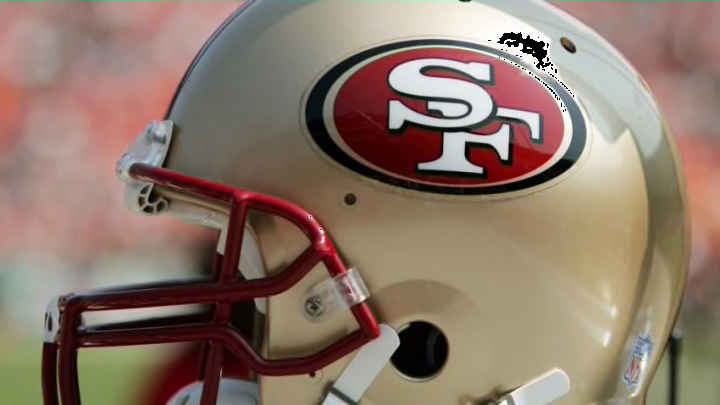
The 49ers have one of the most classic uniform and logo looks in NFL history, but it hasn’t always been that way going back in time.
There are few teams across the landscape of professional sports that have a color scheme as recognizable as the San Francisco 49ers’ red and gold.
While the Niners have varied the color makeup from time to time, including some classic red-and-white throwbacks to that Super Bowl-winning 1994 squad and a somewhat forgettable all-black uniform look, San Francisco’s image is fully recognizable even among the most casual sports fans.
And few teams in the NFL can equal what the 49ers present here.
Then, of course, there’s the logo itself.
Yes, the Niners actually have a few logos. There’s the classic saloon font labeled “49ers” that you now see at Levi’s Stadium in the end zones, which replaced a more modern look that was in the end zone between 2005 and 2018.
Old School #49ers logo in the end zones today. #CINvsSF pic.twitter.com/qtgt9njYtD
— Jennifer Lee Chan (@jenniferleechan) December 20, 2015
The saloon font dates back to 1972, and it’s a great look that has since been adorned on both uniforms and apparel alike in the years since.
But let’s actually focus on the more iconic helmet logo, that classic “SF” on a circular red disk atop a gold helmet.
A history of the 49ers logo
There have been some slight tweaks to the classic logo San Francisco has used since 1968, but the general trend stays the same.
White lettering of “SF” against a crimson-red backing with black trim. In 1989, the 49ers added black trim to the lettering, which made it stand out a bit more. And in 1996, the Niners widened the black oblong trim on the disc and added an interior gold trim, essentially making what San Francisco’s logo is today.
Read More: Ranking every 49ers uniform in franchise history
Albeit with some slight tweaks to the red in the years since.

There are few logos as iconic as that one.
Has the 49ers logo always looked like it does now?
Believe it or not, no, the Niners haven’t always had the same logo since their inception way back in 1946.
For starters, back in 1991, San Francisco experimented with the logo below:
If you thought the Rams' recent logo change was bad, the 49ers' proposed switch in 1991 could have been so much worse.
— 49ers on NBCS (@NBCS49ers) May 14, 2020
What was behind the team's thinking? Find out right here: https://t.co/E1HnIfqDJv pic.twitter.com/nYtu9qU4DP
Good thing that logo lasted only a week before the 49ers pulled it.
They did not, however, pull their inaugural logo when the franchise first launched. And in the shadow of reminiscing about the New England Patriots’ “Pat Patriot,” the Niners’ first logo design from way back in the late 1940s is, well… something:
Best-case scenario with 49ers alternate uniform is their pants are like those worn on the old prospector logo. pic.twitter.com/6rmKbvHQuQ
— Matt Maiocco (@MaioccoNBCS) April 30, 2015
Unlike the one-week 1991 logo, what we’ll assume is the first rendition of Sourdough Sam actually lasted a while, as San Francisco had it as its official logo from that opening 1946 season all the way through 1967 before shifting over to the SF it still uses today.
Perhaps when the 49ers consider some throwback uniforms, they should don those pants, and NBC Sports Bay Area’s Matt Maiocco suggested above.
That’d be an awesome (horrifying) look.
